Goal
A solution to simplify self-evaluation process for candidates and interviewers during the hiring process
Themes
Social Impact
Service Design
Client Project
My Role
UX Designer
Prototyper
Communicator/Storyteller.
Methods & Tools
User-Centric Design
Design Sprints
Accessibility
Visual Hierarchy
Prototyping
Time Frame
7 days
Self Evaluation in UI/UX: List the skills/subjects in UX/UI/Product Design and rate my proficiency in each of them.
Rating Key:
N/A = Not familiar with it.
0 Stars = Theoretical understanding of the skill.
1 Star = Applied the skill in "Hello World" or Prototype projects.
2 Stars = Utilized the skill in production projects, but for less than 3 months.
3 Stars = Applied the skill in production projects spanning several months.
4 Stars = Comprehensive understanding of the subject
5 Stars = Aspiring industry pioneer for this skill, capable of creating educational content for 3-star or 4-star practitioners.
Propose a solution to simplify the self-evaluation process for candidates and interviewers.
The current process of self-evaluation in the interview process during hiring poses challenges for both candidates and interviewers. Existing solutions rely on manual methods, such as copying and modifying diagrams. However, replicating visual elements accurately is difficult, especially for non-designers. This manual process is time-consuming and hinders the allocation of valuable time to research and other essential skills. With the added pressure of deadlines, it is crucial to streamline the self-evaluation process to maximise productivity and focus on core competencies.
The goal was to make candidates active participants in their evaluation journey during the hiring process. They would be empowered to visually represent their skillset and competence levels through an interactive and dynamic knowledge map. Further enriching this process, candidates can link evidence of their proficiency such as course certificates, credentials, and self-directed learning resources.
I began by thoroughly analysing this product space to gain a clear understanding of the opportunities. I also decided to build out my own skill and proficiency map to understand the pain points myself and brainstorm solutions to make the process more efficient.
To create the roadmap diagram, I accessed the GitHub repository and customised it by incorporating my own items. Through focused introspection, I dedicated several hours to accurately assess and rate my proficiency in each skill. The introspective process proved more profound than anticipated.
1st Solution:
Provide candidates with a raw editable file in a software/tool of their choice, allowing them to add new elements in a consistent style. However, this solution may be challenging for non-designers who are unfamiliar with design tools.
2nd Solution:
Create a product that generates a diagram based on user input through a form. The output diagram can incorporate colour codes for easy sorting by interviewers. The product would utilise a combination of logical and visual elements, where nodes, logical jumps, and conditions can be used.
The product interface would consist of an editor panel on the left and an output preview on the right. The editor panel would feature a flowchart, with each element representing a branch in the diagram. Multiple branches can be connected with straight lines.
The advantage of this solution is that the output diagram can be visually complex and appealing, independent of the user's design skills. Users would only need to type and click, making the process straightforward. For interviewers, comparing multiple submissions becomes easier as all diagrams follow the same format, highlighting differences in ratings and enlisted items.
However, the simplicity of the user-created flowchart itself serves as a visualisation, even if it lacks visual appeal. It effectively conveys the necessary information, including connections and branches. Consequently, the output diagram primarily enhances visual aesthetics without introducing additional functionality.
The ideation process began with conceptualising the solution and sketching rough diagrams on paper to visualise the end product.

Here, clicking on the right plus icon created a new branch and then clicking on the bottom plus created yet another branch.
After finalising the basic product structure, I proceeded to create the initial wireframes for the solution. The wireframes served as a blueprint, outlining the layout and functionality of each screen in the product.
I started by sketching rough wireframe drafts, capturing the main components and interactions of the user interface. This helped me visualise the flow of the product and ensure that all necessary elements were included.
Once the initial wireframes were complete, I refined them digitally using design software. This allowed me to add more detail, define the visual hierarchy, and ensure consistency in the user interface.
During the wireframing process, I focused on the editor panel, the form input, and the output preview sections. I paid attention to the placement of elements, such as the plus icons for creating new branches, and ensured that the user flow was intuitive and efficient.
The wireframes served as a crucial foundation for the subsequent stages of the product development, such as creating high-fidelity mockups and implementing the desired functionality.

UX Flow

Upon receiving feedback to incorporate "real content" and enhance the onboarding flow, I made significant updates to the wireframes and design of the solution.
To improve the onboarding experience, I created a dedicated onboarding flow that provided clear instructions and explanations on how to use each control and feature in the interface. This ensured that users, including candidates, would have a smooth and informative introduction to the product.
Additionally, instead of starting with a blank canvas, I implemented the functionality to load a pre-existing diagram that was sent to the candidate. This feature allowed candidates to begin with an existing framework and make modifications or additions based on their self-evaluation.
Throughout this process, I iterated on the wireframes and design, seeking feedback from colleagues and stakeholders to ensure the final result met the requirements and expectations.
Scenario
In the scenario where a diagram with pre-enlisted skills has been sent to the candidate, the candidate opens the interface for the first time. The interface provides a clear and intuitive onboarding flow to guide the candidate through the process.
Upon opening the interface, the candidate is greeted with a welcome message and a brief explanation of the purpose and functionality of the tool. The onboarding flow then demonstrates step-by-step how the candidate can add, delete, rank, and create new branches in the diagram.
To add a new skill, the candidate simply clicks on the plus icon located in the desired branch. The interface prompts the candidate to enter the skill name and select the corresponding rating from the predefined rating options. The candidate can easily modify or delete skills by selecting the skill and choosing the appropriate action from the context menu.
If the candidate wishes to create a new branch, they can click on the plus icon at the bottom of an existing branch. This action prompts the candidate to enter the branch name and add skills to it.
Throughout the onboarding flow, tooltips and pop-up messages provide additional guidance and clarifications on how to interact with the interface. These instructions help the candidate navigate the tool efficiently and make the necessary modifications to the diagram.
By presenting a clear and concise onboarding flow, the interface enables candidates to easily add, delete, rank, and create new branches in the diagram. This intuitive process ensures a smooth and user-friendly experience for candidates using the tool for the first time.
Candidate Flow
Link >
3rd Solution
Another solution to ease the self-evaluation process is to develop a product with drag and drop elements. This approach allows candidates to create their own diagrams by simply dragging and dropping elements onto the canvas. The layout and design of each submission can vary, but the underlying benefits of the previous solution still apply. The elements themselves can be visually appealing, enhancing the overall presentation of the diagram.
Additionally, the product can include a feature that compares multiple submissions and identifies common elements across them. By removing these shared elements, the focus can be shifted to the unique aspects of each submission, making it easier for interviewers to identify standout candidates.
If the product is an in-house tool, additional features such as time trackers, heat maps, and analytics can be incorporated. These features provide insights into the submission process, including session duration and user behavior. This not only helps evaluate the content of the submission but also provides valuable information about the candidate's speed and workflow.
Furthermore, common features like filters can be implemented to facilitate sorting and filtering of candidates based on their ratings or other criteria.
The development process began by sketching out the concept wireframes using a pen and paper. This allowed for quick ideation and documentation of initial ideas and basic features.
Once the concept wireframes were finalized, the next step involved creating mid-fidelity wireframes using a design tool like Figma. These wireframes served as a more detailed representation of the product's user interface and interaction flow.
The ultimate goal was to deliver an interactive prototype in the form of a video. To achieve this, a total of 28 screens were created in Figma, ensuring a comprehensive demonstration of the product's functionality and user experience.

Candidate Flow
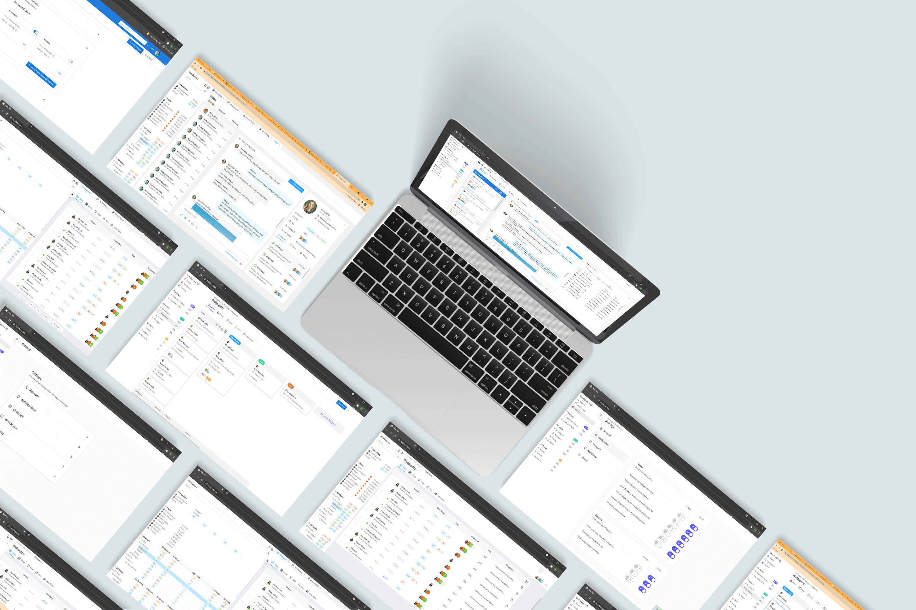
The editor interface of the product allows the user to create and customise their diagram. To add elements, such as shapes, lines, backgrounds, and nodes, the user can select the desired component from the options available in the top-left corner. The selected component will appear in the workspace on the right side of the screen, which serves as the output area.
The editor also includes essential features to enhance the user experience. Users can zoom in and out of the workspace to adjust the view according to their preference. Additionally, they can share their diagram with others, enabling collaboration and feedback. By clicking on the profile icon located at the top-left corner, users can access their personal profile, which may contain additional information and settings.
In case users encounter any issues or have questions, they can find assistance in the "help" section. Clicking on the help button, located at the top-right corner, will provide access to relevant resources and support.
When a specific component is selected, its configuration properties become visible in the bottom-left section of the interface. Users can modify the shape properties to customise the appearance of the selected component. Similarly, the text properties allow users to define and format the text displayed within the shape.
By providing this intuitive and feature-rich editor interface, the product aims to empower candidates to create visually appealing and informative diagrams for their self-evaluation, making the process more efficient and engaging.


Interviewer Flow
This is the interviewer's panel, providing an overview of the candidates' submissions. In the bottom-left section, all the submitted diagrams are displayed, allowing the interviewer to review and evaluate them. By selecting a specific submission, it enlarges, enabling the interviewer to make modifications or annotations if necessary.
The top-left area presents the candidate's details, providing essential information about the individual under consideration.
Several options are available to the interviewer, facilitating the process of shortlisting candidates based on their diagram submissions.
Total time taken: The interviewer can view the total time taken by each candidate to complete the assignment. This information provides insights into the candidates' efficiency and time management skills.
Versions: The system records versions of the submissions at specific time intervals. This feature allows the interviewer to track the progress and iterations made by the candidates throughout the assignment.
Skill filtering: The interviewer can filter the skills based on the ratings provided by the candidates. This feature helps in identifying candidates who excel in specific skills or meet certain rating criteria.
Unique submissions: Another option available to the interviewer is the ability to remove skills that are present in all submissions. This process results in each submission becoming unique, enabling easier comparison and evaluation of candidates based on their distinctive qualities.
By incorporating these features into the interviewer's panel, the product streamlines the evaluation process, providing the necessary tools and information to make informed decisions and select the most suitable candidates.

Prototypes
Candidate Flow
Link >
Link >
Interviewer Flow
Link >
Hi Fidelity Mockups
To create high-fidelity mockups, I utilised the company's brand guidelines, which served as a starting point for the design process. Brand guidelines provide essential information about colours, fonts, and other design elements that align with the company's branding. Incorporating these guidelines ensures consistency and coherence throughout the mockups.
Having access to a brand guide is crucial for developing high-fidelity mockups, as it helps justify the selection of colours and fonts. While colour theory can provide some guidance, branding plays a significant role in defining these choices, particularly in real-world scenarios.
Using the design system components provided by the company, I created two mockups—one for the candidate's dashboard and one for the interviewer's panel. These screens established the overall style and atmosphere for the rest of the interface. By maintaining consistency in design elements, such as colours, typography, and layout, the mockups reflected the company's branding and created a cohesive visual experience.
By adhering to the brand guidelines and leveraging the design system components, the resulting high-fidelity mockups captured the intended style and mood, effectively representing the overall look and feel of the product.


Drawing from our research and insights, we can indeed conclude that restroom behaviour, while often overlooked, has far-reaching implications. This case study has shed light on the essential role of service design in driving change in such a seemingly mundane yet impactful area.
In our efforts to transform bathroom etiquette, we've examined the issue from various perspectives, considering the cultural, social, and environmental aspects. We've found that the problem doesn't lie solely in the behaviour of individuals but also in the larger systems and environments that shape this behaviour. Our interventions have been designed with this holistic view in mind, targeting not only tourists but also the broader ecosystem of stakeholders including local authorities, facility managers, and waste management companies.
Moreover, we've seen that effective communication is key. In the design of our interventions, we've taken into account language barriers, cultural nuances, and the need for clear, concise messaging. We've leveraged digital tools and strategic partnerships to broaden our reach and increase our impact.
Furthermore, we've recognised that systemic change doesn't happen overnight. It requires ongoing effort, monitoring, and adjustment. Through our proposed KPIs, we've laid out a framework for tracking our progress and making necessary improvements. We understand that we're embarking on a journey of continuous learning and adaptation.
So, while bathroom etiquette may seem like a minor aspect of travel, it is an important one that can greatly impact the tourism industry. And as we've seen, it extends beyond tourism to affect local communities, the environment, and public infrastructure. It's time for us to recognise the importance of proper flushing practices and make it a priority for both locals and tourists alike.
As the saying goes, 'When in Rome, do as the Romans do.' This is especially true when it comes to bathroom etiquette. We hope that through our efforts, we can encourage tourists and locals alike to adopt responsible flushing habits. After all, small changes in our flushing habits can have a big impact on the environment and local communities. Let's work together towards a cleaner and healthier planet.